Let’s talk COLOR.
Choosing colors for your embroidery projects should be done with consideration and purpose.
Color is a key tool for creating a design with flow and balance.
Let’s look at few examples from the Stitched Stories Shop:
Mushrooms
The mushroom cap colors are garnet shading into orange and gold–and they are absolutely the focal point of this piece. The green and brown elements work to frame (and emphasize) the mushrooms..

Let Freedom Ring
Red is a color with more visual weight than blue (i.e., it attracts the eye more strongly). Thus, on Let Freedom Ring, when shapes have red fills, those fills are rendered with stripes, grids and repeating motifs–but not with a solid fill. The solid star fills are done with light blue. In this way there is visual balance.

The word “freedom” is filled with textured and thick chain stitching in a medium blue. This medium blue is used only here–and that gives the word added visual emphasis.
Navy is used to define shapes as well as the circular framing of the piece.
Tree of Life
While the Tree of Life design is stitched onto white fabric, the profusion of circles effectively create a backdrop of greens (with bits of blue).
The birds are stitched in contrasting colors: salmon and gold. They take up less space than the circles, and, yet, they become focal points because of their color isolation in a field of green.

Moths
Color creates flow (i.e., guides the eye) on this design of Moths that could easily become a busy piece without a focal point.
The moth in the center is stitched in warm colors: orange, coral, garnet, gold. It’s surrounded by two visual triangles:
- The first triangle is created by the three grey and coral tiger moths. Grey dominates which establishes a clear difference from the central moth.
- The second triangle incorporates three different moths but they are rendered in cooler colors of blue and green. Accents of gold and orange unite them with the central moth and give the entire piece unity and balance.

Mountain Time
Mountain Time is divided into two horizontal bands. The top band is dominated by warm colors: garnet, rust, coral, and apricot. The lower band is cooler with a mix of greens and olive-gold.
Two distinct spots of warm color are layered onto the lower band: 1. the fox, and 2. the tent. Their addition creates a visual triangle of the warm colors, and that guides the eye around the piece.

Start With Coffee
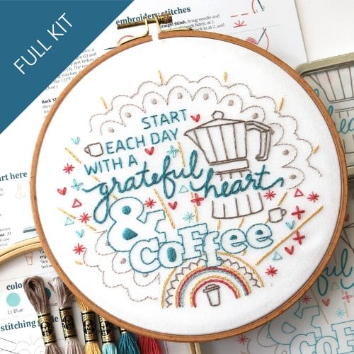
The lengthy quote on Start with Coffee needs to read clearly despite its changing fonts and alignments. Stitching the whole quote in dark turquoise unites all of these words. That color is only used for the text. It’s not repeated elsewhere.
Two shades of driftwood create the backdrop of coffee pot and doily edging. Gold, red, and a light turquoise are used in lesser amounts to create accents that lighten the piece.

Are you inspired to embroider any of these designs?
OR–do you want to scroll through HERE to spy more examples of clever color combos to inspire your next embroidery project?
Embroidery that celebrates homey comforts...
Morning coffee, kind words, or slow napping afternoons, take your pick. These best-selling favorites are perfect for a kitchen nook, a thoughtful gift, and cozy handmade touches.


